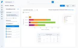
Visualize findings and understand your security posture
Humans, as a species, are visually dominant: the size of the human cortex devoted to processing visual information is larger than the cortices processing any other sensory modality. This means that the visual graph that translates the information from your vulnerability scanner has a higher impact on your awareness and will definitely be key for your decision-making process.
Analytics serves as a crucial component in any risk vulnerability management platform. It translates vulnerability dashboard results into clear visual representations, offering enhanced comprehension of your current status. These insights shed light on the effectiveness of security measures, providing stakeholders with a clear view of the organization’s risk posture.
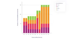
About a year ago, we developed our own risk score, a powerful tool for prioritization. Last month, in our latest release we incorporated a new graph by risk score for our Analytics section.
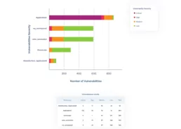
Common belief often highlights critical vulnerabilities as the highest risk for organizations. However, in effective risk management, emphasis should be on the exploitable vulnerabilities. You would be thinking like an attacker, which vulnerabilities are easier to exploit?
Our risk scoring system goes beyond mere criticality analysis, pinpointing precisely where real vulnerabilities lie. It offers a straightforward representation, not just an objective evaluation framework, but a curated set of filters tailored to prioritize based on specific contexts. Prioritization becomes a time-saving asset; now, you can filter vulnerabilities from a hacker’s perspective.
Now, find our new graph of vulnerabilities by risk score and see it more clearly. Reduce the noise and focus on what’s actually exploitable.
Scan your domain and use Analytics to make informed decisions.
Reach out our team of experts for more information.
Related Posts
Using Faraday API for Vulnerability Management
Within our team, we prefer to focus on specific tasks depending on the type of host and the associated vulnerabilities. Exploiting a…

Ten years of cybersecurity, a lifetime of hacking.
Faraday was born from the fusion of entrepreneurial spirit and a desire to break staffs. These elements naturally emerged in Federico…

Good practices in Cybersecurity – Part 1
Pentesters use a comprehensive and complete toolkit to expose different platforms and evaluate the security of an IT infrastructure. They…